
2022 CF Games Detailed Analysis Part 2
INTRODUCTION
The 2022 CF Games created lasting memories. Tia won yet again; Justin defended his title. Roman Khrennikov and Ricky Garard broke through. Brooke Wells returned from a horrible injury. But we’ll leave those stories to the athletes and their teams. Instead, we looked at the numbers. Numbers tell stories too, and we’re going to uncover some of them. We looked at:
The impact of athlete physiology and anthropometry
Relationships between event
Margin of victory, alternative scoring and the implications for athletes and coaches
ATHLeTE BASICS

Women competitors tend to be a little bit younger. But the women’s side has a greater proportion of athletes outside their 20s (interestingly, in both directions) whereas the men are clustered more in the mid-late 20s. This may indicate that men have a shorter window to reach the Games. The age breakdown looks like this:

But the real issue is: does any of this matter? And the answer: Not that much! Athletes have undergone a rigorous qualification process which produces a “type” of athlete within the parameters described above. Whether that athlete is 22 years old or 29 did not matter much on the leaderboard or for any given event. Let’s take a closer look.

Not much to see here. Perhaps this is due the emergence of younger athletes who started CrossFit as kids and as a primary sport; these younger athletes have as much experience as the older athletes. The correlation between age and sandbag results were a little bit higher than the other events, suggesting that older athletes might possess more raw strength. However, those correlations are so low as to be unimportant.
If age doesn’t matter, what about height and weight?

On the men’s side, most of the correlations are very weak, with none in excess of r = 0.4 or -0.4. There was a weak correlation on the Alpaca; heavier athletes generally placed higher. But on the women’s side, several correlations were much stronger. Any correlation greater than r = +/- 0.4 is emphasized in the chart. The strongest correlation was for Alpaca; heavier athletes placed higher. (A negative correltion means the athlete placed higher in the event). Alpaca required athletes to move a heavy sled; it is unsurprising that bigger athletes placed higher. The highest correlation on the men’s side (r = -0.399) was also for Alpaca. We believe that data show that heavier athletes have an advantage on the Alpaca. This result is not surprising.
For the women, weight was also correlated with placement in Rinse N Repeat, Hat Trick and Sandbag. The correlations for the men are weaker, but show the same relationships. There is evidence that heavier athletes benefited on the Sandbag event, DB Snatches (Hat Trick), and Rinse N Repeat.
There were no events in which height or weight were a substantial disadvantage. However, there is some indication that taller, heavier athletes did worse on Echo Press. Larger athletes also fared worse on Elizabeth Elevated. We are not surprised that bigger athletes fared worse in events which were defined primarily by gymnastics.
CAPS PER EVENT

The events with the most CAPs were events which introduced new equipment or movement standards. When new equipment or movements are introduced, the learning curve is often too steep, even for the exceptionally fit. (Note: no athletes finished Skills/Speed Medley, which required crossover double unders, another new movement).
The relationship between fitness and motor learning is unclear. There is also evidence that the top predictor in Elizabeth Elevated may have been previous gymnastics experience rather than overall fitness. Event winners Pat Vellner and Arielle Loewen both have gymnastics experience. When new equipment or movements are introduced, variables other than fitness may be decisive.
CORRELATIONS AMONG EVENTS
We reviewed the relationship between placements in each event and athletes’ overall final placement. This provides some insight into the alignment between the fitness requirements for given event and the characteristics needed for overall success. We anticipated every event showing a positive correlation with overall results, because a high score in any event, increases the likelihood of a high finish. The correlations are as follows:
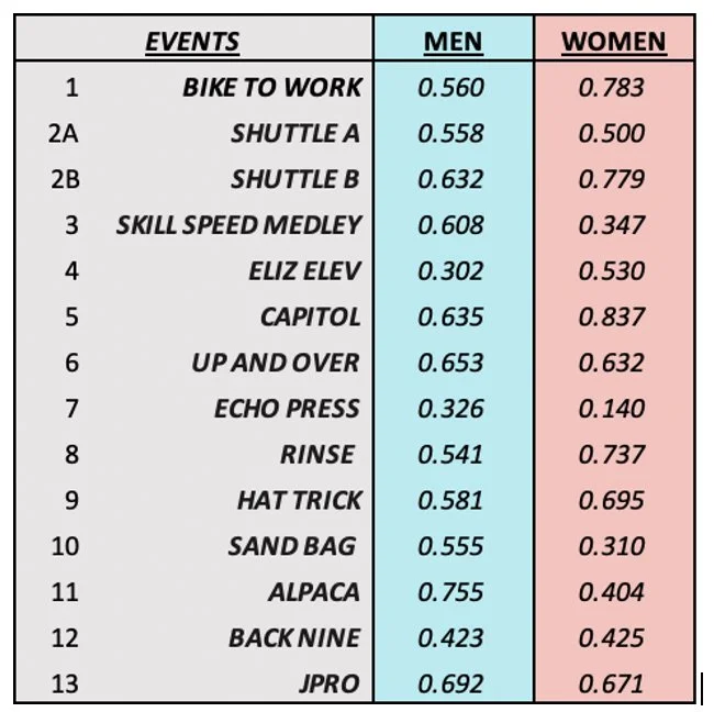
As expected, placement in every event is positively correlated with overall placement. On the men’s side, Elizabeth Elevated and Echo Press had the lowest correlation with overall results. This is additional evidence that the introduction of new equipment or movement standards creates results unrelated to overall fitness. We were surprised at the high correlation between Alpaca and overall results for the men.
For the women, Echo Press was almost uncorrelated. This event overall had little relationship to athlete fitness. The Capitol was an effective predictor of results for the women (and to a considerable extent, for the men). This is not surprising, the Capitol required athletes to display cardiorespiratory endurance and muscle endurance, as well as pure strength. Carrying a heavy object up the stairs, while tired, is a fantastic test of fitness.
Strength did not appear to matter that much. The sandbag is an effective test of raw strength, but this did not predict overall results terribly well. For the women especially, the correlation was very low.
The difference between Shuttle B for the men and women is likely due to the women having less time to lift. Therefore, women who got a very high score on Shuttle B also had a very high score on Shuttle A; two high scores are an excellent predictor of overall high placement. This relationship did not hold for men; some male athletes got lower scores on Shuttle A and still managed high scores on Shuttle B.
INDIVIDUAL EVENT CORRELATIONS
A test of broad, general fitness should exhibit low correlations between the events. If the events between the correlations were very high, that would be evidence that the same narrow set of characteristics is being tested repeatedly. Many high correlations could potentially diminish the legitimacy of the claim of broad general fitness. An example of an excessively narrow test would be something like a super total. Super total is an excellent test of strength and power, but few would agree that it's a test of broad, general fitness.
While the ideal chart would be a correlation of 0 among all the events, this is a theoretical ideal and not at all realistically achievable. There are certain foundational characteristics of fitness such as coordination, power, endurance, and so forth that are deterministic in nearly any collection of fitness tests. A realistic goal is for low correlations among all the events. This goal was achieved – the planners of the Games succeeded without a doubt in creating a broad, general test of fitness. There are no correlations on the men’s side in excess of 0.6 and none of the women’s side are in excess of 0.7. Many events have very low correlation.


For both men and women, The Capitol shows consistent positive correlations with placements in other events. The demands of this event were so broad that success here indicated capacity for success in many other tests. Again, we see low correlations on Echo Press and Elizabeth Elevated, adding support to the idea that these were not effective tests of broad, general fitness.
We believe the data shows that the Games Team did an outstanding – almost flawless – job of testing broad, general fitness. The only detectable flaw – a small one - was in Shuttle B: Men and Women took different tests. The women had much less time to run, which meant that only the exceptionally fit women earned a high score in Shuttle B. Therefore (1) Shuttle B for the women is much more predictive of overall results and (2) Shuttle B has much higher correlations with other events for the women. This small flaw had no effect on the podium placements.
INDIVIDUAL RESULTS AND MARGIN OF VICTORY
Next, we looked at individual performances while considering margin of victory. The scoring system is indifferent to margin of victory, but margin of victory is an expression of fitness. For example, Tia was awarded 100 points for her win in Shuttle B, with a score of 18 reps. However, if she had completed 19, 25 or 40 reps, she still would have received 100 points, despite expressing a much higher level of fitness.
The Margin row in the chart below reflects the athletes’ margin of victory. Events in which the Margin is negative are timed events; the winner was faster than average. When the score is positive, the event is measured in pounds or reps, so the winner was above average. Skills / Speed Medley was not included. That event did not lend itself to straightforward margin of victory calculation. Margin of victory is calculated by calculating the average and standard deviation of the raw scores (not placements) for each event. The Margin Entry is the number of standard deviations between the winner and the average.


Dani Speegle’s Sandbag result was the most dominant event win of the Games. It is likely that we did not see the full measure of her dominance; she likely could have lifted more than 250 pounds. Tia won two events by very large margins. For the men, Pat Vellner’s win in Elizabeth Elevated was the most dominant performance. His result was even more dominant; athletes who exceeded the time cap were not included in the analysis. Both Pat and Dani were more dominant than their scores show.
Winning an event usually requires an athlete to be 1.5 standard deviations away from the mean. Scores of more than two standard deviations away from the mean are less common. Interestingly, the same pattern holds for semifinals. Next, we looked at the margins among the top 5.


These results further illustrate the dominance by the winner. Note that Tia’s wins were extremely dominant. In general, the women’s margins of victory, measured as the gap between 1st and 5th were a bit larger. This may be evidence that the men’s side is more competitive, or it may simply show that Tia is more dominant than any male athlete. Further investigation could illuminate the relative competitiveness of both side.
Note that Tia’s two event wins were by enormous margins. Haley’s win on Shuttle A would have been a gigantic margin, except that Tia was not far behind. This indicates that Tia has tremendous strengths and no meaningful weaknesses. Medeiros never exhibits the same dominance as Tia, but is rarely beaten by a large margin. This means Justin has no weaknesses, but no towering strengths. Margin of victory scoring is very effective for identifying weaknesses.
ALTERNATE LEADERBOARD
Just for fun, we re-did the top 10 based on margin of victory. To compute this, all scores where the athletes outperformed the average were made positive and all scores below average were made negative. Athletes who exceeded a cap saw their scores reduced by 0.5 per capped event; all athletes over the cap received the same score in an event. Skills Speed medley is not included.

Roman and Justin flip-flopped, but they were separated by under 30 points. This flip flop is because Roman won an event and twice finsihed second, giving him more margin of victory points. Tia’s dominance becomes even more apparent using this format.The margin of victory leaderboard is less forgiving of weaknesses. Finishing below average in an event subtracts from your total score using this format. This format can be usefulfor identifying weaknesses and apportioning training time. More on that in a future article.
CONCLUSION
The numbers tell a story of an incredibly effective fitness test and worthy champions. Programmers should consider providing advance notice of new equipment or standards, as these ideas usually measure previous athlete experience, rather than fitness directly. Furthermore, we believe the women and men were tested different in Event 2. However, we believe the test was effective at its intended goals.
Questions / Comments / Feedback: coach@thegainslab.com
Did you miss Part 1? Check it out here
Interested in an analytical, individualized approach to training? Email us.